
Start with the actual customer task
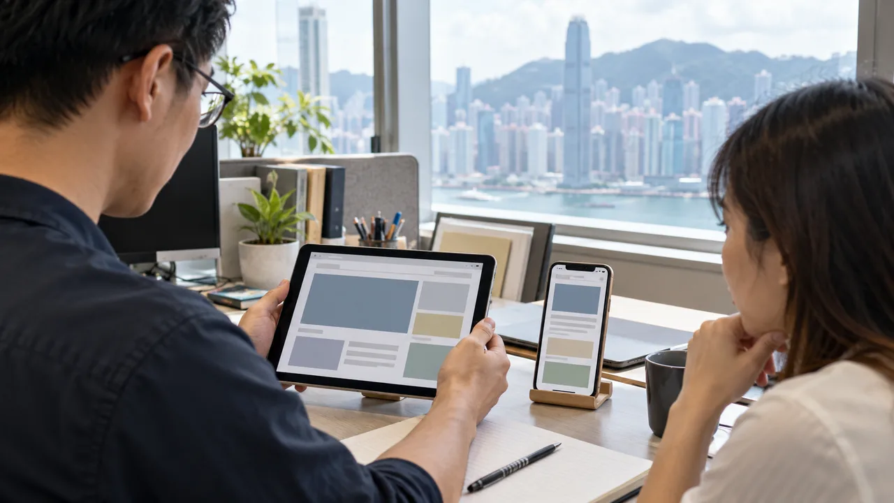
A phone held upright is common, but it is not the only way someone can use a customer site. A tablet may be fixed to a stand, a phone may be mounted on a wheelchair, and a person may keep a device in one position because rotating it is painful or impractical. If the site asks them to turn the device before they can read a product, complete a booking, or send a request, the interface has imposed a physical requirement on the customer. WCAG 2.2 criterion 1.3.4 addresses that restriction: content should be viewable and operable in either portrait or landscape unless a particular orientation is essential. For a normal shop or enquiry journey, begin by assuming both orientations should work.
Write down the journey before opening a device emulator. For example, a buyer finds a product, chooses a variation, reads delivery information, reviews a total, and sends an order. An enquiry visitor reads the service page, opens a form, corrects a validation error, and receives a clear confirmation. A page that loads in landscape but hides the final submit control has failed the practical task even if its first screen looks plausible. Record the same starting point, account state, content language, and test data for both orientations. That makes a comparison about the interface rather than about two different journeys.
Do not confuse the criterion with a promise that every pixel remains in the same place. A responsive page may move a sidebar below the article or replace a wide menu with a compact control. Those changes can be appropriate if the information and actions remain usable. The orientation question is whether the author forces one orientation or makes the other unusable because it is the other orientation. A separate small-viewport or reflow defect still deserves repair, but describe it accurately. The owner who receives the issue needs to know whether to remove a lock, fix the layout, or do both.
A useful handover to a developer is a decision about behaviour, not a request for a particular breakpoint. Specify that the order review and submission remain reachable in both orientations, including after a validation error. Let the implementation team choose the responsive layout, then verify the resulting task with a person who was not involved in its design. This keeps the acceptance standard tied to the customer rather than to one proposed CSS rule.
Find what imposes the restriction
A blunt orientation lock may be easy to spot: the app rotates its content sideways, blocks the page with a turn-your-device message, or refuses to advance. Other restrictions are less obvious. A full-screen panel may have been designed only for a wide aspect ratio, leaving its action buttons beyond the visible area in portrait. A vendor checkout embedded in a frame may respond differently from the surrounding site. Test the real production-like journey, including payment handoff, account prompts, dialogs, and error states; stopping at the landing page misses the places where an imposed orientation matters most.
First check the browser and operating-system behaviour, because a user may deliberately lock their own device orientation. The W3C distinguishes a user-controlled device setting from an author-imposed restriction. If the operating system is locked to landscape and the page follows landscape, that alone is not a website fault. If the device is allowed to rotate but the site insists on portrait, inspect the page or app code and any third-party component for a forced orientation setting, a blocking overlay, or a CSS arrangement that prevents access. Ask the component owner to demonstrate the flow in both states, not merely to show a screenshot.
An essential exception is narrow. W3C offers examples such as a bank check or a piano application, where the nature of the content may require a particular orientation. A merchant's product photo being prettier in landscape, a promotional video fitting better, or a form being easier to build in portrait is a design preference, not evidence that the customer's task is impossible otherwise. If a team claims an exception, document the exact feature, why its meaning or operation depends on that orientation, and whether the surrounding task can still be completed another way. Have someone outside the feature team challenge the explanation before treating it as an exception.
Make the task work in both states
For a standard web journey, remove the blocking message or forced content rotation and let the layout follow the viewport. Give text and controls flexible space, allow vertical scrolling, and keep essential actions in a reachable order. A wide comparison table may need an accessible horizontal scroll area or a different small-screen presentation; the answer is not to make the entire purchase journey landscape-only. A modal should fit or scroll within the available viewport. If a sticky footer covers the primary action after rotation, change its layout or spacing and verify the control remains reachable with a keyboard and touch.
A worked example helps separate cause from symptom. Imagine an online appointment flow whose calendar fills a landscape tablet. In portrait, the date grid still appears, but the confirmation button is outside a fixed-height panel and cannot be scrolled into view. The team might be tempted to tell users to rotate. A better repair is to let the panel grow or scroll, keep the selected date visible in a compact summary, and move the confirmation action after the selection in the reading order. Retest a long service name and an error message, because those text states can consume the space that looked sufficient in the empty prototype.
W3C documents a technique in which content that normally restricts orientation provides a user control to change its orientation. That is a possible route for a truly specialised experience, and the control itself must be findable and operable before the user is trapped. For an ordinary SME website, it is usually simpler to avoid the restriction entirely and respect the operating-system choice. A switch that is hidden behind the very orientation block it is meant to solve is not a useful remedy. Any alternate view must preserve the same information, controls, saved entries, and outcome, or the choice is superficial.
Test a release, not a mock-up
Use a real device that supports rotation and, where useful, a browser emulator to reproduce several viewport shapes. Start in portrait, rotate during the journey, finish the task, then repeat from a fresh state in landscape. Rotate while a menu is open, while a form contains data, and after an error appears. Check that focus does not disappear, fields do not reset unexpectedly, and the next action remains identifiable. Repeat with the English and Traditional Chinese versions, since a longer label can expose a panel that only seemed to fit in one language. The acceptance record should name the device, browser, page variation, task, and observed result.
Treat a failure as a customer consequence, not a cosmetic score. If a landscape-only screen prevents a visitor from completing a request on a mounted device, identify the blocked step and a repair owner. If both orientations work but a decorative photo is cropped differently, that is a different priority. Do not claim that passing this one check proves the whole site accessible: keyboard access, zoom, reflow, contrast, and clear errors require their own tests. The decision for release is specific: can a customer view and operate this task in either available orientation, with an exception only where the content genuinely makes one essential?
Keep one evidence row for each blocked step: what the customer was trying to do, the orientation and page state, what was visible, what control could not be reached, and the behaviour after repair. That turns a vague instruction to 'make it responsive' into a reproducible acceptance task. Include a representative narrow landscape viewport and a portrait tablet, not only the two familiar phone screenshots. If a third-party checkout owns the restriction, send the same observed steps to that provider and track the fix through the real handoff. A visual workaround in your own header does not repair a payment page that still refuses the customer's chosen orientation.
Decision checks
- The customer can start and finish the same task in portrait and landscape.
- No author-imposed rotation message blocks a normal journey.
- Any essential exception has a specific documented reason.
- Both languages and mid-task rotation have been tested.

